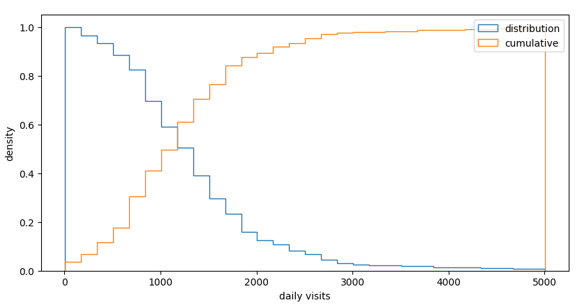
 distribution of daily visits
Our customer knows how many sales receipts are issued with an hourly resolution over around 400 gas stations in the country.
We call the reference data visits and our measured data activities.
To map activities into visits we have to correct different skews:
The project considers the following quantities:
| project | numbers |
|---|---|
| Owned locations | 417 |
| Total locations | 1184 |
| clusters | 824 |
| zones | 503 |
| cilacs | 2508 - 3025 |
| daily visits < 1k2 | 50% |
The customer expectation are summarized in 4 KPIs:
| KPIs | threshold | goal loc % |
|---|---|---|
| correlation ρ | > 0.6 | 80% |
| difference δ | < 0.2 | 80% |
| capture rate | 0.5% <> 9% | 80% |
| passanger/car | 1.1 <> 1.9 | 80% |
 distribution of daily visits
Raw data consists in numbers of receipts per hour per location. We present the data week per week to show the differences between locations:
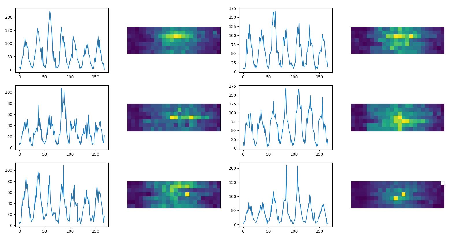 reference time series, each panel present a
different location and a different week. A week is represented as an
image of 7x24 pixels
Locations show different patterns about daily and weekly peaks. Sometimes deviations between two days or two hours are really strong.
We homogenize the data converting the time series into matrices to make sure we have data for each our of the day. We than replace the missing values interpolating:
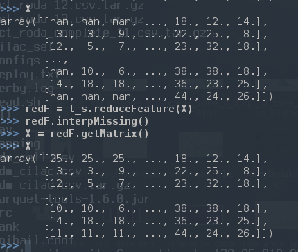 replace missing values via
interpolation
In order to compensate the effects of time shifting (can counts double within two hours?) we apply a interpolation and smoothing on time series:
 to
the raw reference data we apply: 1) polynomial interpolation 2)
smoothing
Some locations are particularly volatile and to monitor the fluctuations we calculate the χ2 and control that the p-value is compatible with the complete time series. We substitute the outliers with an average day for that location and we list the problematic locations.
 Distribution of p-value from χ2 for the reference
data
We than replace the outliers:
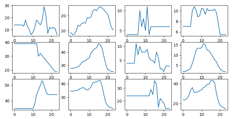 outliers are replaced with the location
mean day, left to right
We build an autoencoder which is a model that learns how to create an encoding from a set of training images. In this way we can calculate the deviation of a single image (hourly values in a week 7x24 pixels) to the prediction of the model.
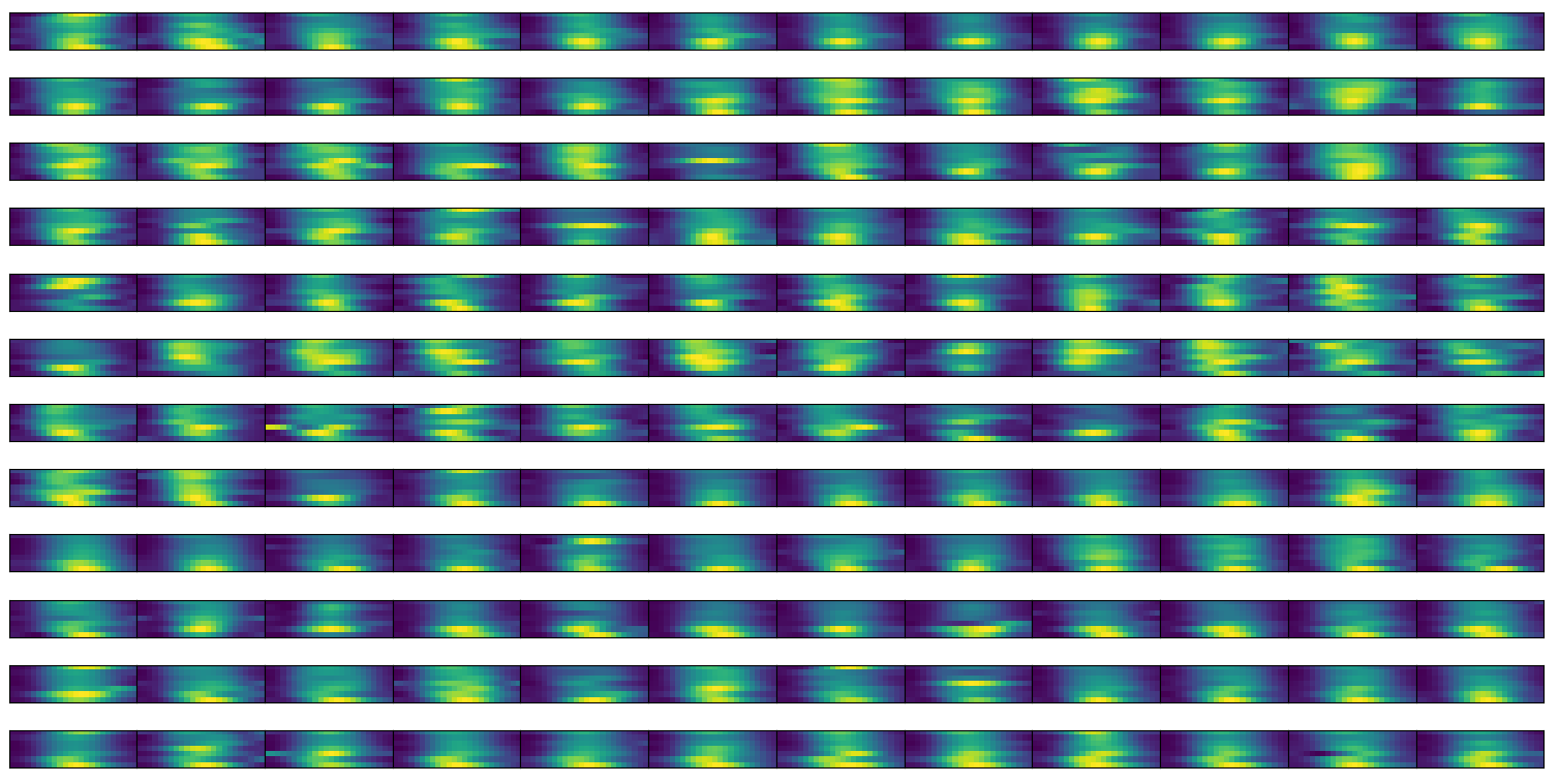 sample set of training images, hourly counts per week
In this way we can list the problematic locations and use the same model to morph measured data into reference data.
We train a deep learning model on images with convolution: 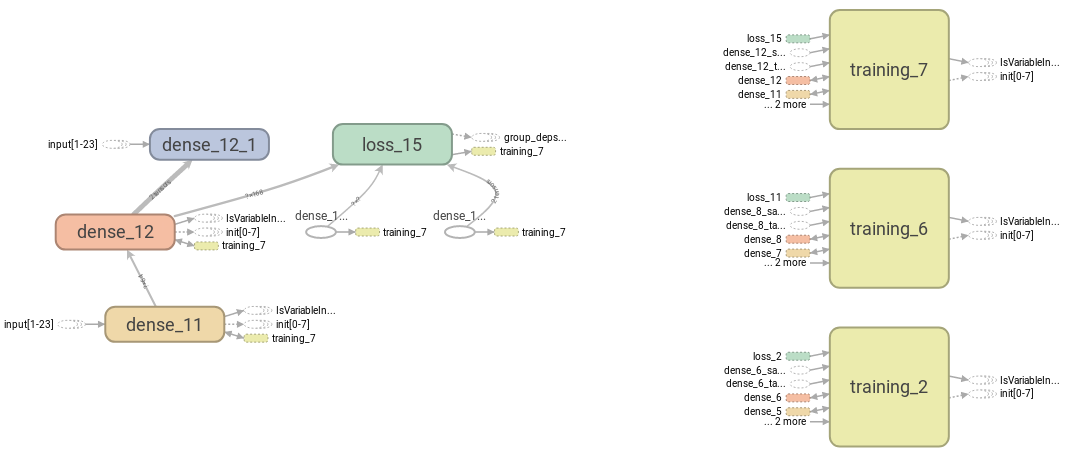 sketch of the phases of learning
We than test how the images turn into themselves after the prediction of the autoencoder.
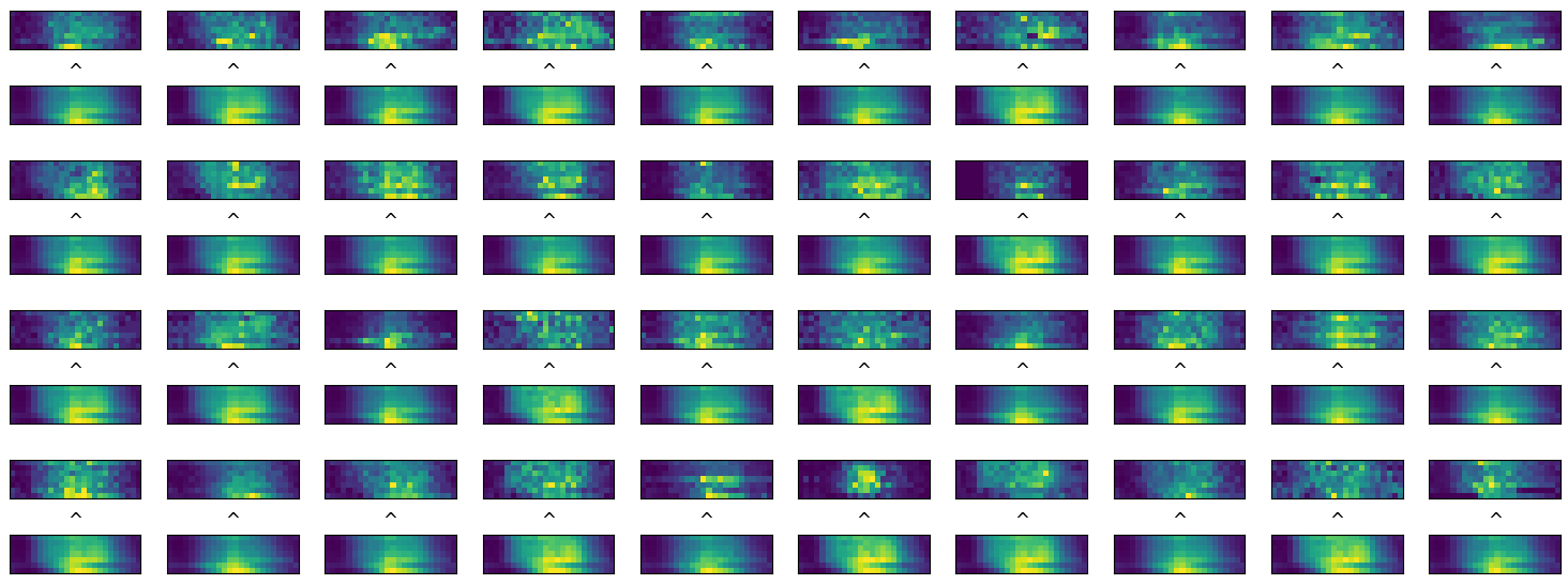 comparison between input and predicted
images
We can than state that 88% of locations are not well
predictable by the model within 0.6 correlation. 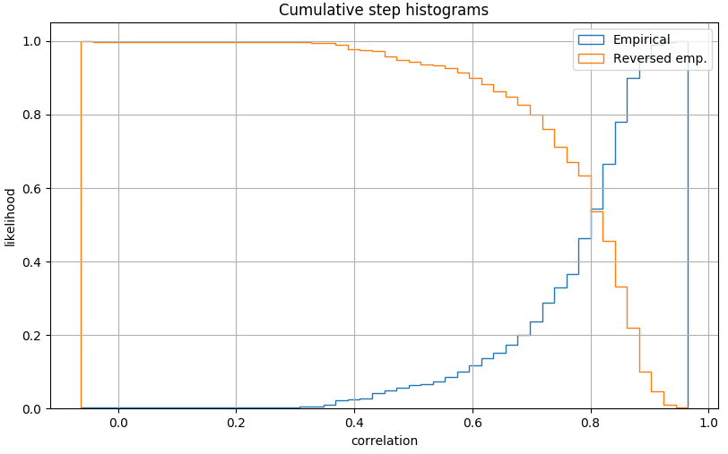 distribution of correlation for autoencoder performances:
correlation on daily values
Holidays have a huge effect on customer side. The plot shows activities and visits for the month of March, the last Thursday of the month prior to easter shows a huge variation only on reference data.
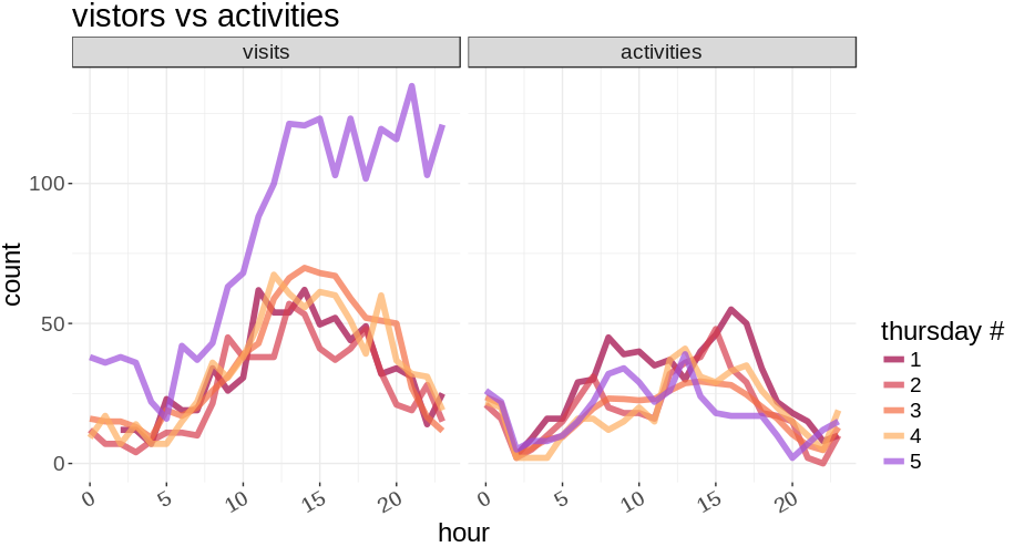 Visits versus activities in Mach approaching
easter
The same effect was seen in March 2017 in the test data. 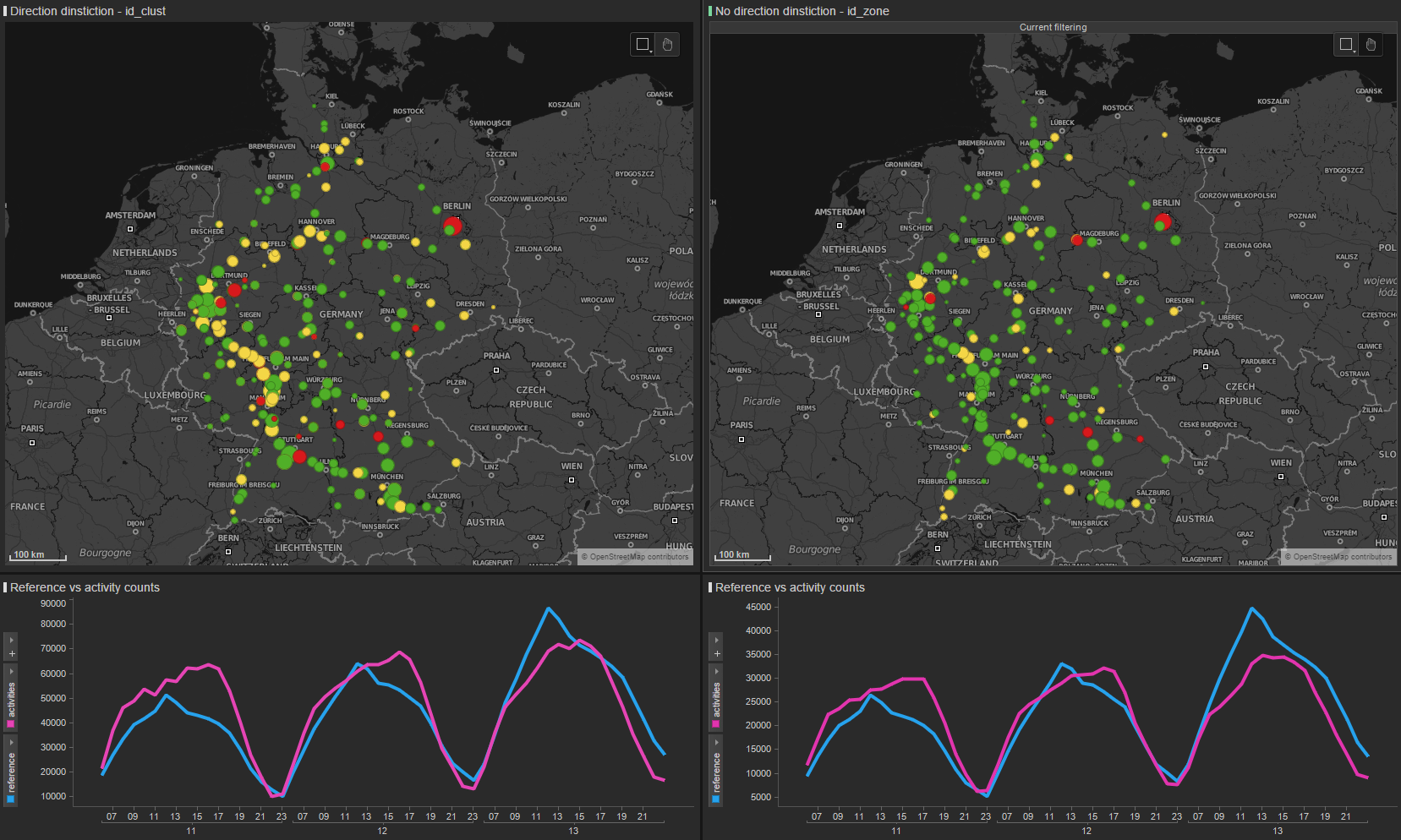 Easter
effect is visible only on reference data, blue line
Gas stations are sometimes composite, we don’t receive complete information about all the visits in the area.
 in same
cases we don’t know the receipt counts for some buildings on the gas
station
We should consider which extrapolation factor has to be used for motorway drivers:
Some road segments have large fluctuations and large mismatch between
visits and activities A81 Stuttgart - Friedrichshafen: 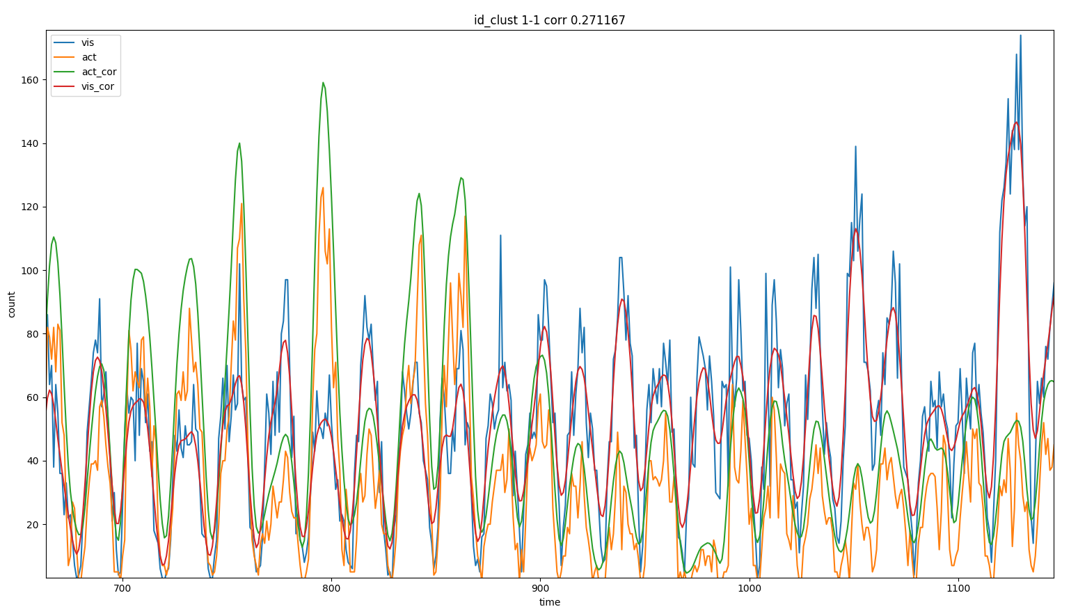 for some locations fluctuations are large and activities and visits
don’t correlate
Our user base is mainly composed by business traveller that during week days might represent over 50% of the market share on the motorway during working days. During weekends the number of business traveller is lower represented, especially on sundays.
We see a large discrepancy in the difference between visits and
activities depending on week days. 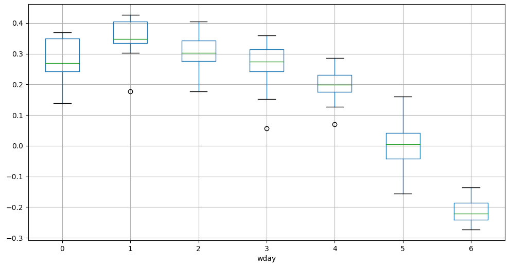 boxplot of the difference between visits
and activities depending on the week day
Weather has an influence on deviation as well, we can show for
example how the minimum temperature influences the mismatch. 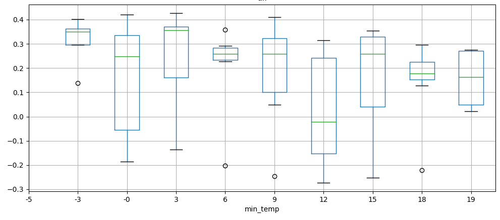 deviation vs minimum temperature,
binned
We select the most relevant weather features over a selection of 40.
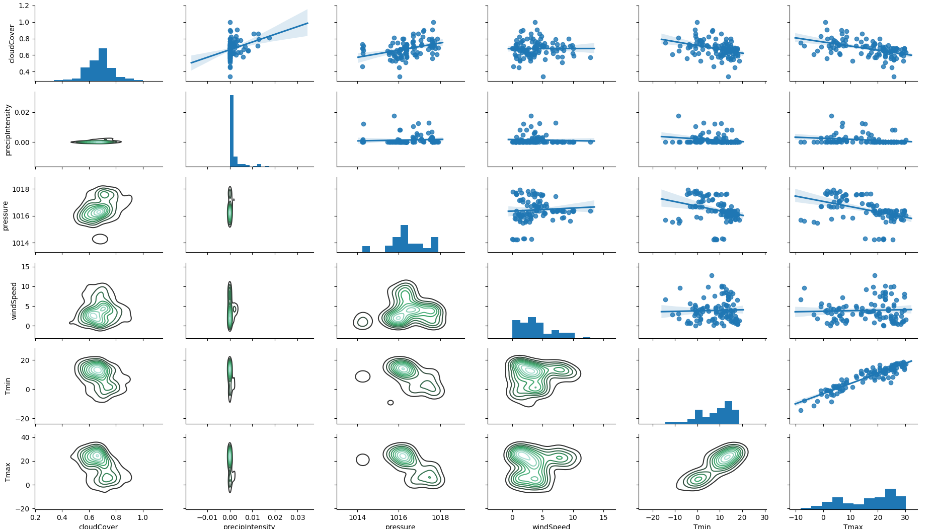 correlation between weather
features
Other weather related parameters have an influence on the mismatch.
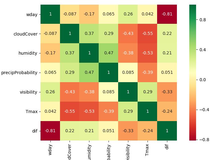 weather has an influence on the deviation: di../f/f
We use the enriched data to train a regressor to adjust the counts.
Each street has a different pattern concerning the week day. We can simplify the cataloge classifying street segments with the label commuter or touristic. We use the kears library to load and parse bast data.
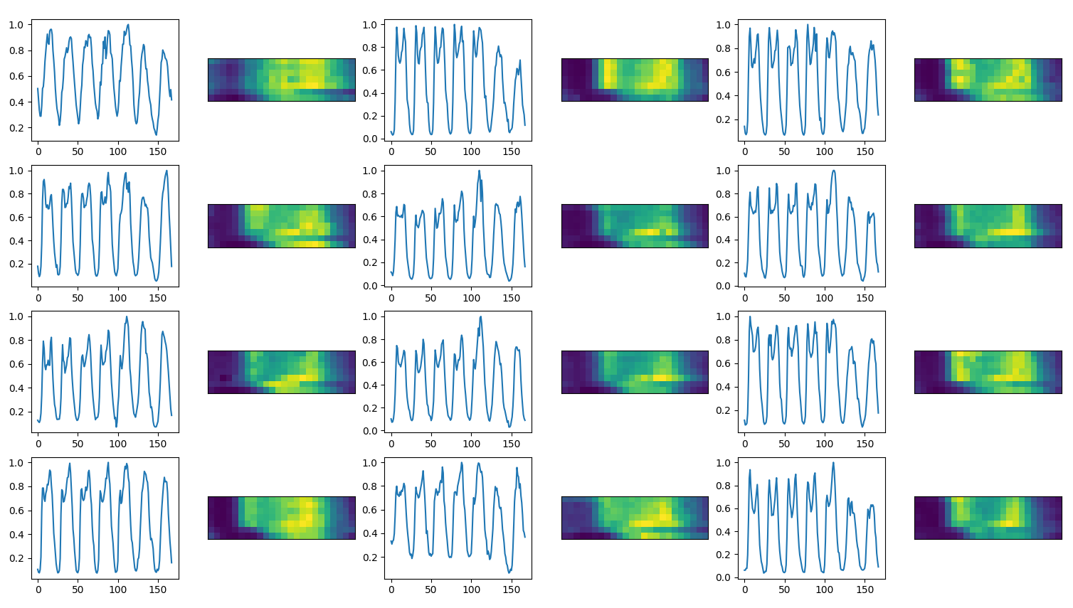 BaSt raw data, some locations have a daily double
peak, some locations have more traffic on the weekend
We control the performances of an autoencoder on BaSt raw data:
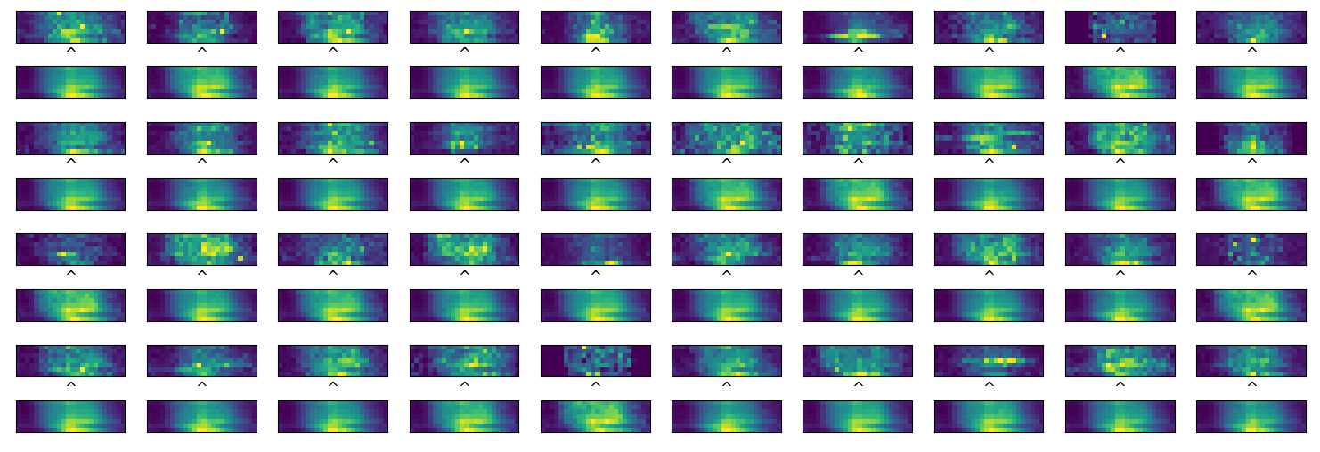 Performances of the BaSt autoencoder,
fluctuations are flattened
Commuter segments show higher counts during the week, the touristicc over the weekends. Our reference data are the BaSt counts which provide a correction factor for the weekday, especially friday and sunday:
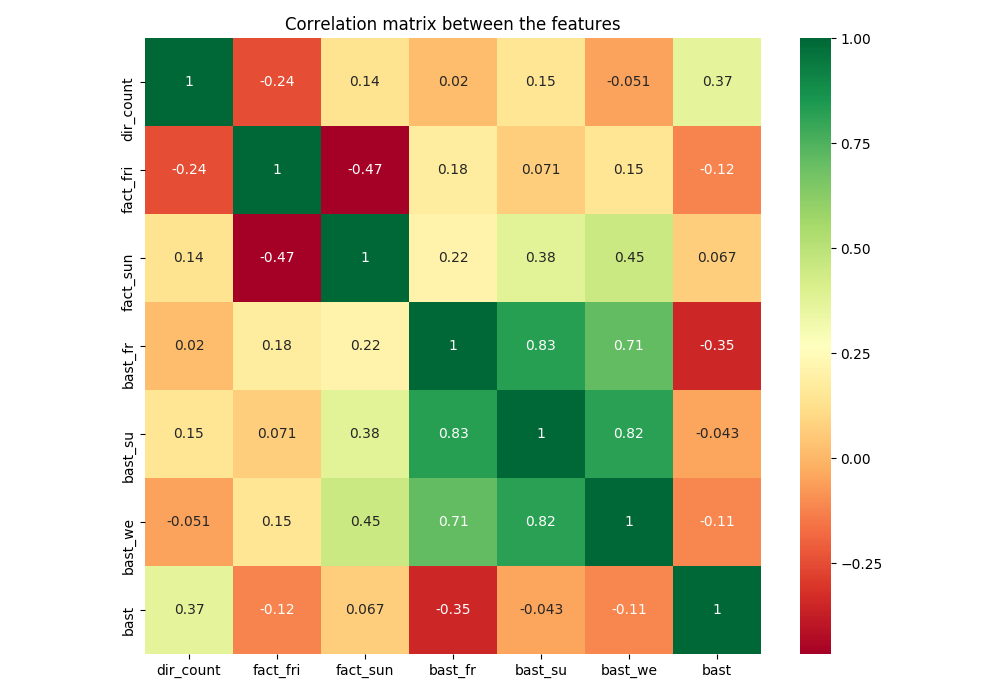 correction of direction counts, our numbers counter correlate with
reference numbers
We don’t find any significant correlation between BaSt and visits.
Population density has an influnce on mismatch  we
see bad correlation in dense areas (blue diamond) and good correlation
in less populated areas (red diamond
For our training we than consider as well information about
population density in an area of 2 km. 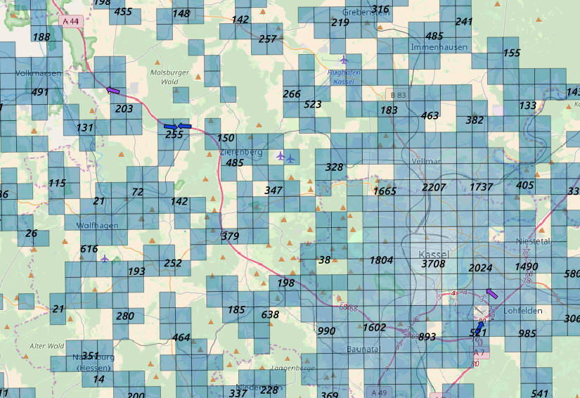 we enrich our data with information about
population density
Sometimes direction distiction does not perform well  we have good correlation on one side
of the motorway (red diamond) and poor correlation on the other side
(blue diamond)
Motorway drivers show an elasticity effect: their cell phone is
bounded in a cell for a distance longer than a walker. In many cases
BSEs do not cover the region of the gas station. We than consider many
cells around the gas station: 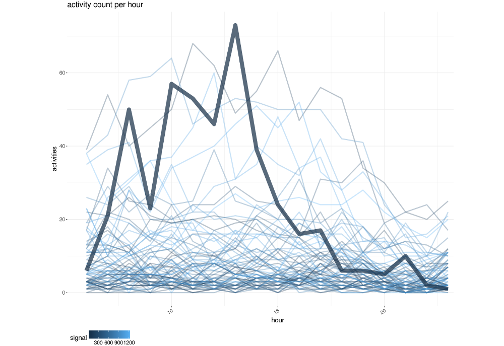 example of reference data (thick line)
and the activity counts of the cells in its neighborhood
We than apply a trip distance filter to select only users that had
traveled a certain amount of km prior to the activity. The filter is
optimized on reference data but don’t describe the real activities of
motorway drivers. 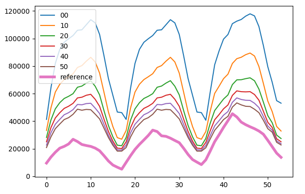 trip distance filter optimized on activity counts
We see that low counts have an higher relative error.
Locations with few visits per day are the hardest to match, precision depends on absolute numbers.
 boxplot of counts deviation relative to number
of visitors
Tracks are guests of specific gas stations and carry different devices.
 huge parking spot for tracks
The number of people per car changes over weekday. We expect a similar behaviour in the numer of people per receipt.
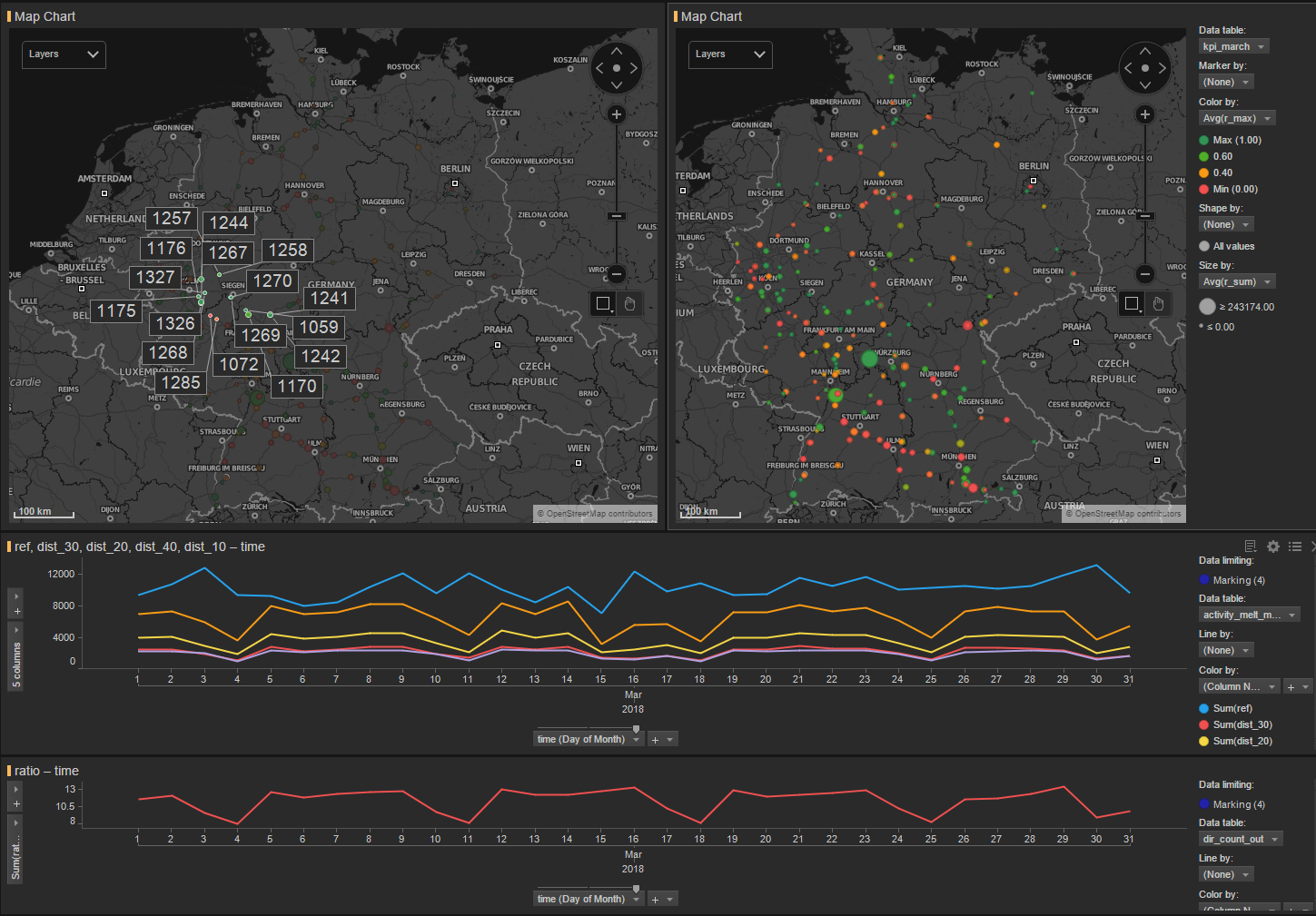 deviation of
the mean number of people per car during a week (red line)
We studied the statistical properties of a time series collecting the
most important features to determine data quality. 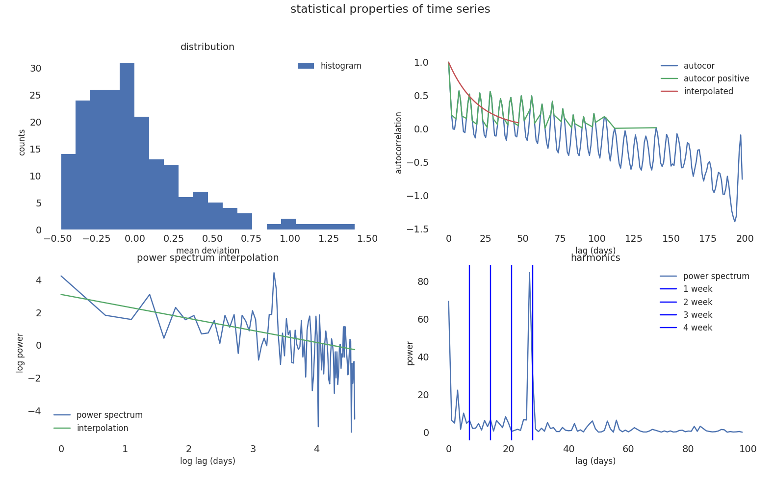 most important statistical properties of time
series
We calculate the feature importance on model performances based on
statistical properties of time series of reference data. 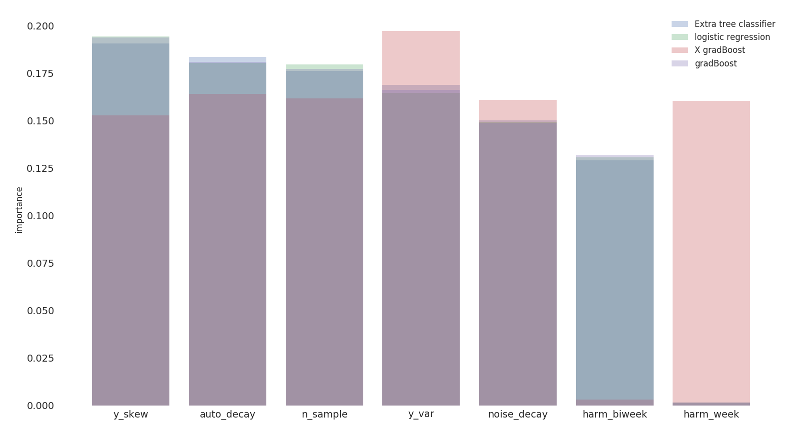 we obtain a feature
importance ranking based on 4 different classification models
daily_vis: daily visitorsauto_decay: exponential decay for autocorrelation –>
wie ähnlich sind die Tagennoise_decay: exponential decay for the power spectrum
–> color of the noiseharm_week: harmonic of the week –> weekly
recurrenceharm_biweek: harmonic on 14 days –> biweekly
recurrencey_var: second moment of the distributiony_skew: third moment of the distribution –>
stationary proofchi2: chi squaren_sample: degrees of freedomWe try to predict model performances based on statistical properties
of input data but the accuracy is low which means, as expected, that the
quality of input data is not sufficient to explain the inefficiency in
the prediction. 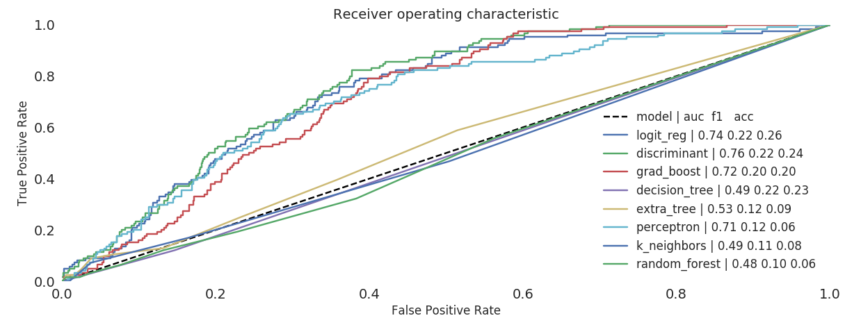 training on statistical properties of input data vs model
performances
We now extend our prediction based on pure reference data and
location information 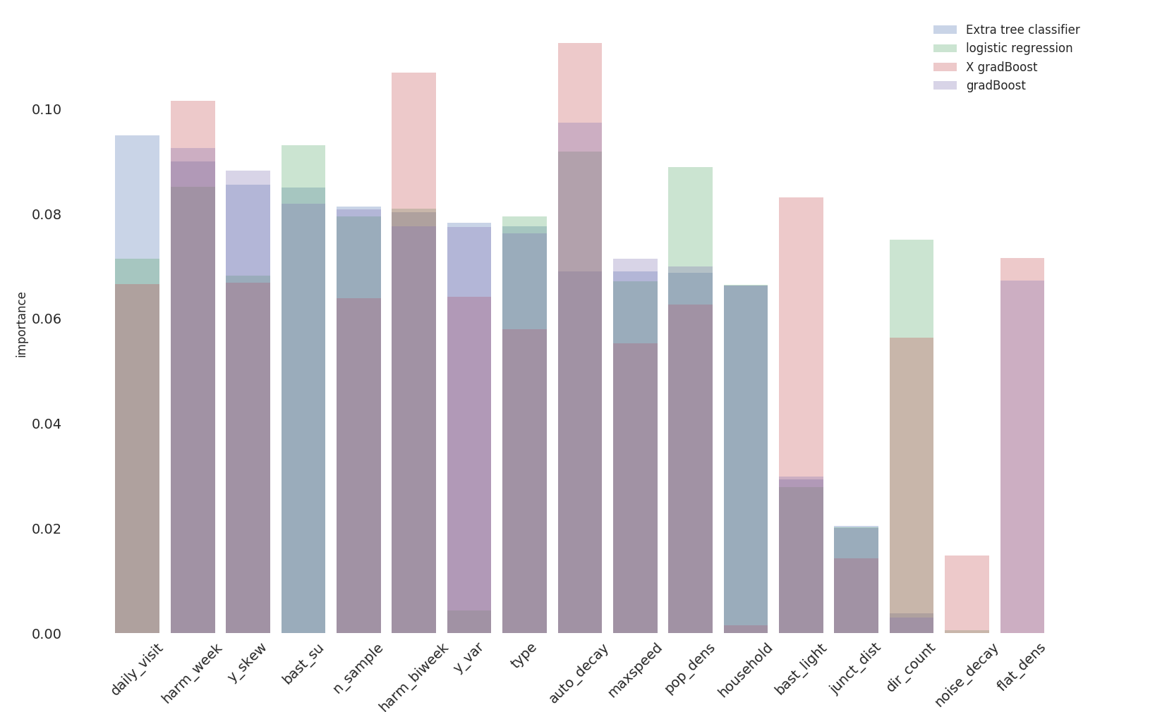 feature
importance based on location information and input data
Knowing the location information we can predict the performace within
80% of the cases. 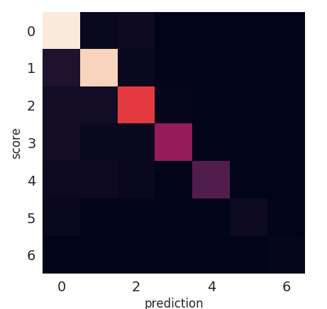 confusion matrix on performance prediction based on location
information
All the skews we have shown are used to train predictors and
regressors to adjust counts: 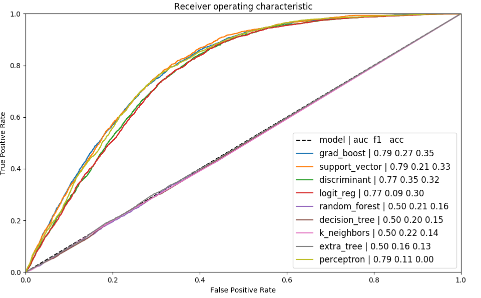 ROC of different
models on training data
Thanks to the different corrections we can adjust our counts to get
closer to reference data. 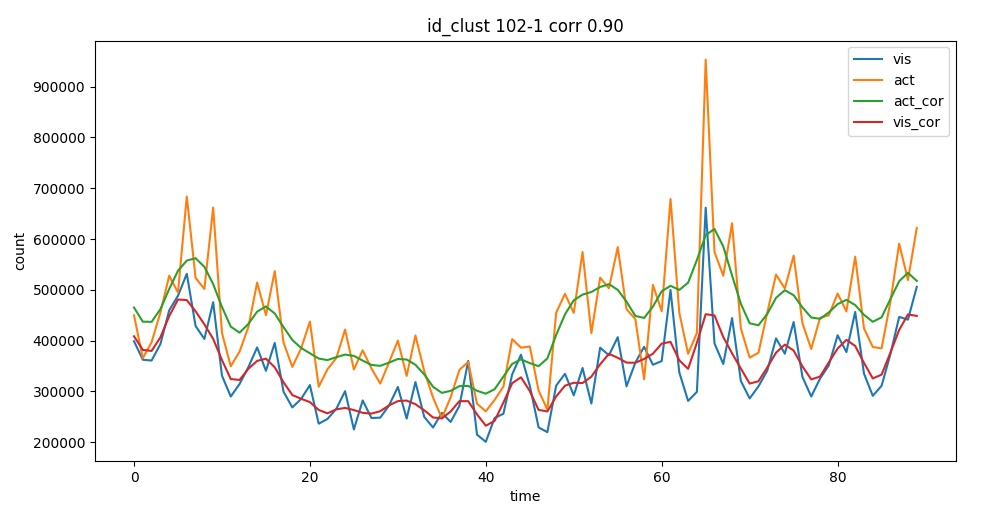 corrected
activities after regressor
We have structure the analysis in the following way: 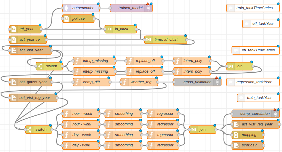 structure of the calculation for the yearly delivery
We can than adjust most of the counst to meet the project KPIs
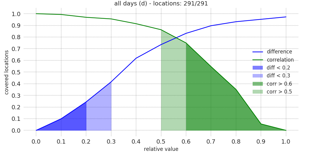 distribution of the KPIs ρ and δ
We have scraped from internet other reference data to evaluate the accuracy of our models: i.e. google maps, which consists in normalized time series called popularity.
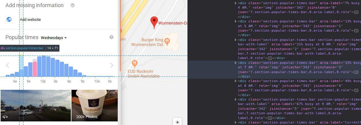 popularity
of a gas station and the css attributes we scrape from internet
Screaping the page we can extract the information about the curves etl_google.js.
var occTime = []
$.each( $('.section-popular-times-graph'), function(i,curveL) {
    $('.section-popular-times-value',curveL).each(function(j,labL) {
    occTime.push(labL.parentNode.attributes['aria-label'].nodeValue);
   });
});
copy(occTime);
A more sofisticated project uses selenium selenium.js to create a bot which searches for a location with the same name of the POI. It selects the more plausible result using Levenshtein distance, waits the page to be loaded and reads the css attributes for the popularity curves and saves them.
We can then overlap the curves and calculate the mutal agreement
between sources 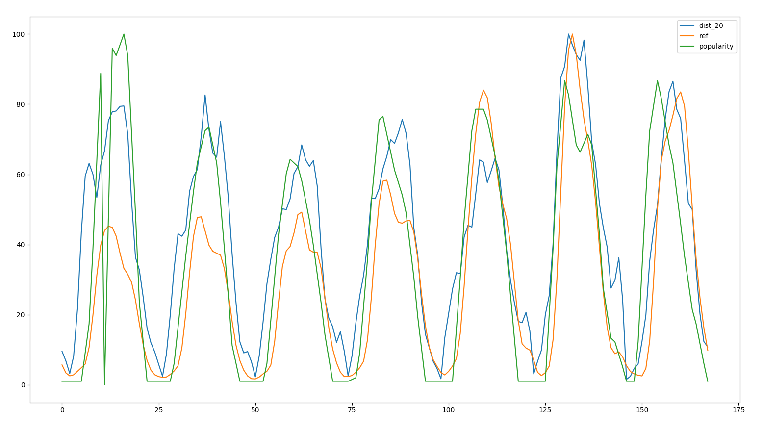 activities, visits and popularity for a location
We than see that the agreement between visits and activities is the
largest. 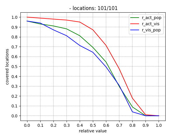 accuracy
between activities, visits and popularity
We now see the correlation between a service station and a restaurant.
To build the comparison we build first a pseudo day, ex:
Service station and restaurant share the same location  Both activities share the same potential
customers
If we look at the correlation between locations on the same platform:
id_poi |
cor_d |
cor_h |
rank_d |
rank_h |
|---|---|---|---|---|
| 1020 | 0.41 | 0.57 | 0.14 | 0.68 |
| 1033 | 0.39 | 0.68 | 0.30 | 0.72 |
| 1043 | 0.37 | 0.64 | 0.48 | 0.71 |
| 1222 | 0.26 | 0.63 | 0.25 | 0.66 |
| 1289 | 0.60 | 0.53 | 0.51 | 0.62 |
| 1518 | 0.27 | 0.73 | 0.31 | 0.78 |
| 1545 | 0.40 | 0.62 | 0.49 | 0.69 |
cor_ Pearson correlation, rank_
Spearman correlation, _d daily values, _h
hourly values
Althought the hourly values have a good correlation (same daily trend) daily values have an unpredictable result.
Service station and restaurant share the same location 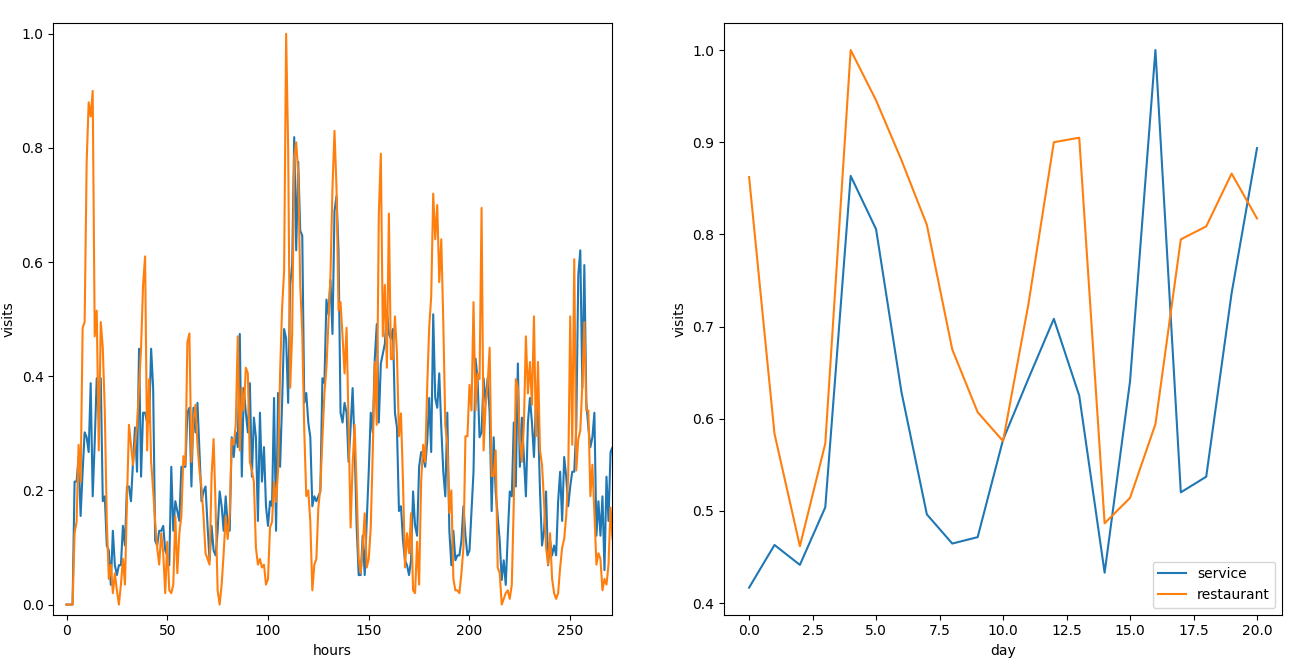 difference between the curves, daily values don’t correlate on a
pseudo day
If we refer to a real day we have a strong correlation:
| id_poi | cor_d | cor_h |
|---|---|---|
| 1020 | 0.75 | 0.66 |
| 1033 | 0.85 | 0.77 |
| 1043 | 0.76 | 0.71 |
| 1222 | 0.86 | 0.66 |
| 1289 | 0.82 | 0.66 |
| 1518 | 0.82 | 0.82 |
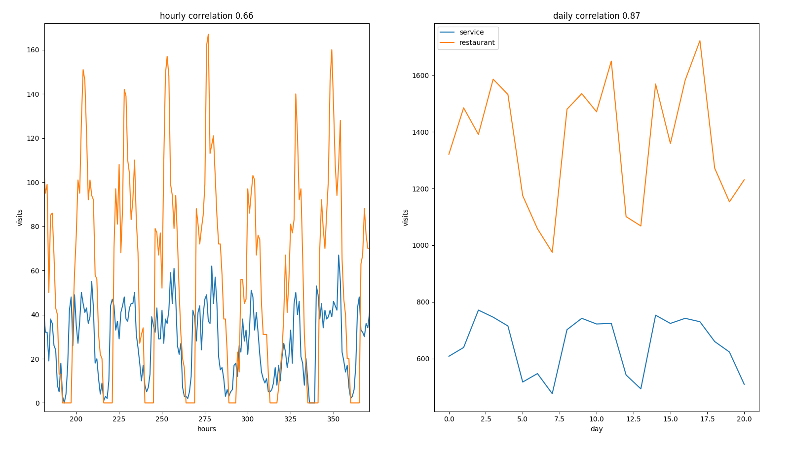 correlation between service and restaurant on equal days
That means that we have a bad definition of a pseudo day and we have big fluctuations within days.
The scope of the project is to count how many motorway drivers
stopped by a competitor. The current definition of a competitor is weak
since a motorway driver has a more dense options to stop for
fuel/eating:  customer
locations (blue) and competitor ones (purple), a driver has many more
options than the ones pointed (from google maps)
It would be much more reliable to label all the users who have been routed on a motorway and report all the activity with a short dwelling time:
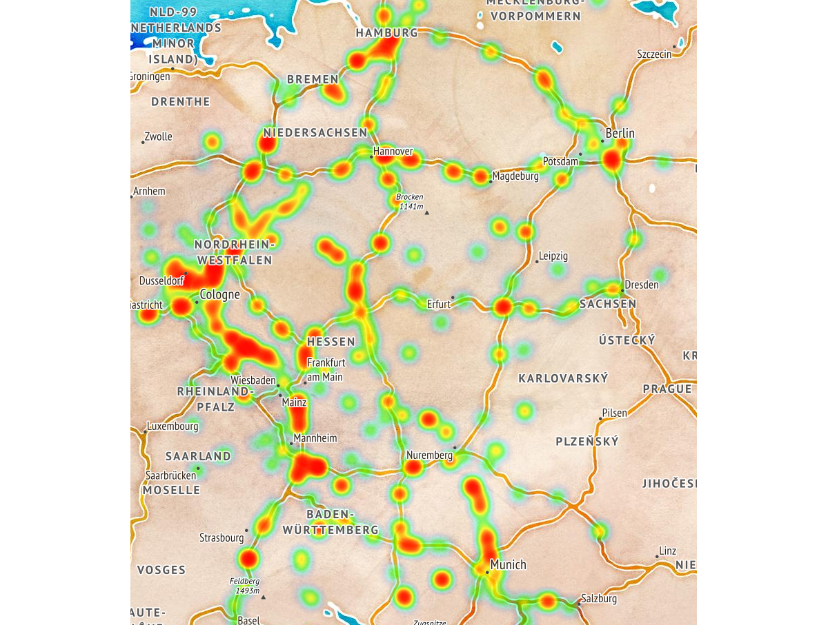 heatmap of motorway drivers stopping during a
trip
