 Blue arrows show the gas stations and the direction of the traffic and the green dots the position of the centroids of the cell
On the motorway there are isolated gas stations. Few activities but few cells too.
 Blue arrows show the gas stations and the direction of the traffic and the green dots the position of the centroids of the cell
We should be able to isolate inhabitants between stoppers on the motorway. We want to distinguish as well the direction where the drivers come from. Gas stations might be:
 satellite views of different gas station locations
And the can be present on both sides. We can have up to 4 sources of bills per side (restaurant, gas stations, rest rooms) and we should be able to attribute a corresponding number of people per bill. We are currently using the maximum per hour between all sources per building. >How can we filter our data to detect motorway stoppers?
We use a combination of filters
From our users we know:
For the test pilot we will consider three days in april ’17 to tune and validate the model. ## Procedure We structure the work in the following way:
We performed some quick check about consistency in the data.
The distribution of the trip distance is regular 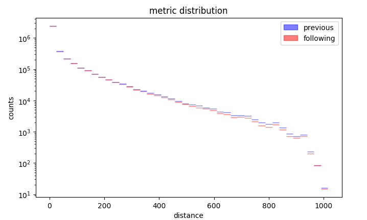 Distribution of the trip distance
Duration as irregular distribution apart from half hour binning 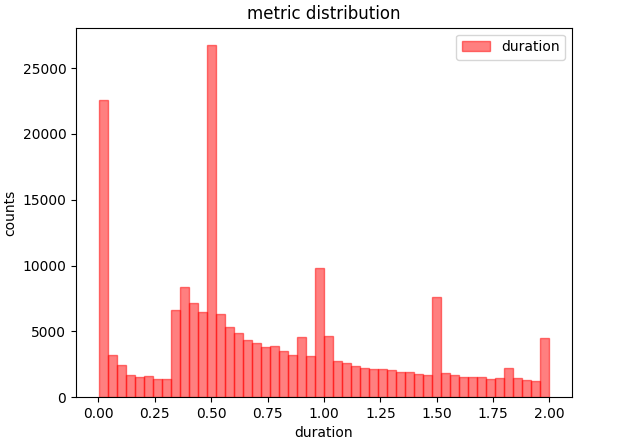 Distribution of duration
We can than observe that chirality wihtin a day is conserved: 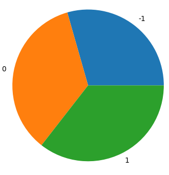 χ=0 and χ=1 are equally distributed, chirality 1 and 2 are two alternative definitions
We preprocess customer data with etl_tank.py where we load customer bills counts and locations:
vist = pd.read_csv(baseDir + "raw/tank/poi_tank_visit.csv")
bist = pd.read_csv(baseDir + "raw/tank/poi_tank_visit_bon.csv").fillna(method='ffill')
tvist = pd.read_csv(baseDir + "raw/tank/poi.csv")
We filter out only the typical heavy traffic hours and convert the timestamp:
bist = bist.loc[ [x>5 for x in bist['hour']] ]
bist = bist.loc[ [x<24 for x in bist['hour']] ]
bist.loc[:,'time'] = bist[['day','hour']].apply(lambda x:'2017-04-%sT%02d:00:00' % (x[0][0:2],x[1]),axis=1)
We sort all the cilacs within a certain sphere in the same cluster:
disk = ((cells['X']-x_c)**2 + (cells['Y']-y_c)**2)
disk = disk.loc[disk <= max_d**2]
cellL.loc[dist.index,"cluster"] = c["cluster"]
We prepare then the data to be structure on a matrix, cells on the rows, time along columns. 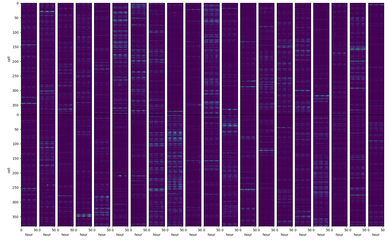 matrix representation of the input data
We apply a distance filter to select only the motorway stoppers among all the activities captures by the cell in the area etl_tankAct.py.
We apply different trip distance filters on the input data: * prev: on the previous trip * sym: symmetric, previous + following trip * asym: asymmetric, previous and following trip
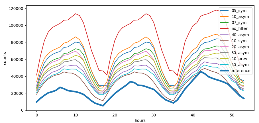 Trip distance filter
Trip distance filter has different effect on every single cell.  Effect on the trip distance filter on correlation with reference data, the smaller the circle the higher the trip distance filter, the redder the color the higher the correlation
We can see that for some cells we have a positive effect of the filter while in some case even counterprodictive effect. Some cells are not correlated at all with the activities at the gas station.
To distinguish between directions on the motorway we use a metric that distinguish the orientation which can be clockwise or counter clockwise wrt a reference point which we put in the center of the country. The metric is called chirality and is calculated by:
$$\chi = \frac{\vec v \times \vec w}{||v|| + ||w||} > 0 $$
Where v⃗ is the vector connecting the previous activity to the current activity and w⃗ the center of the country with the previous activity.
 The color of the arrows show the opposite chiralities We see that chirality distinguishes both sides of the motorway and is independent on the current angle.
deCenter = [10.28826401, 51.13341344]
start = self.events[0].coordinates
end = self.events[-1].coordinates
v1 = [start[0] - deCenter[0],start[1] - deCenter[1]]
v2 = [end[0] - start[0],end[1] - start[1]]
crossP = v1[0]*v2[1] - v2[0]*v1[1]
return 1.*(crossP > 0.)
vector product between trip and conjunction to the center of Germany
We can see that we have correctly distinguished the trips dependent on the chirality. 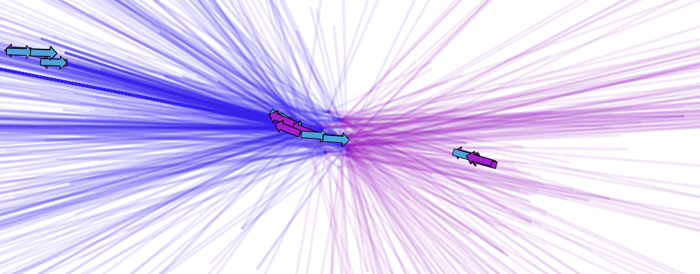 trajectories colored by chirality
We want to recognize the type of user clustering different patterns:
different patterns for kind of user
We calculate characteristic features by interpolating the time series. We distinguish between a continous time series where we can calculate the overall trends via the class train_shapeLib.py
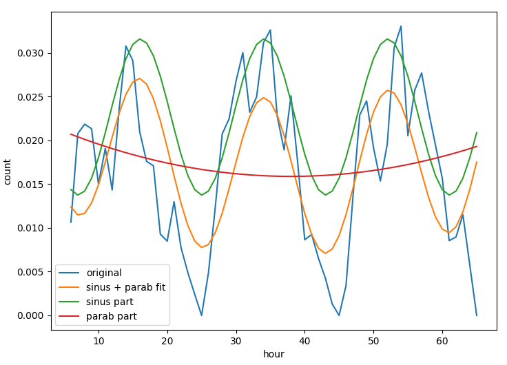 time series of a location and the daily average where we can understand the typical daily activity.
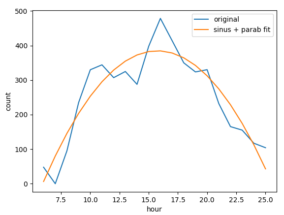 daily average of a location Many different parameters are useful to improve the match between mobile and customer data, parameters as position of the peak, convexity of the curve, multiday trends help to understand which cells and filters are capturing the activity of motorway stoppers.
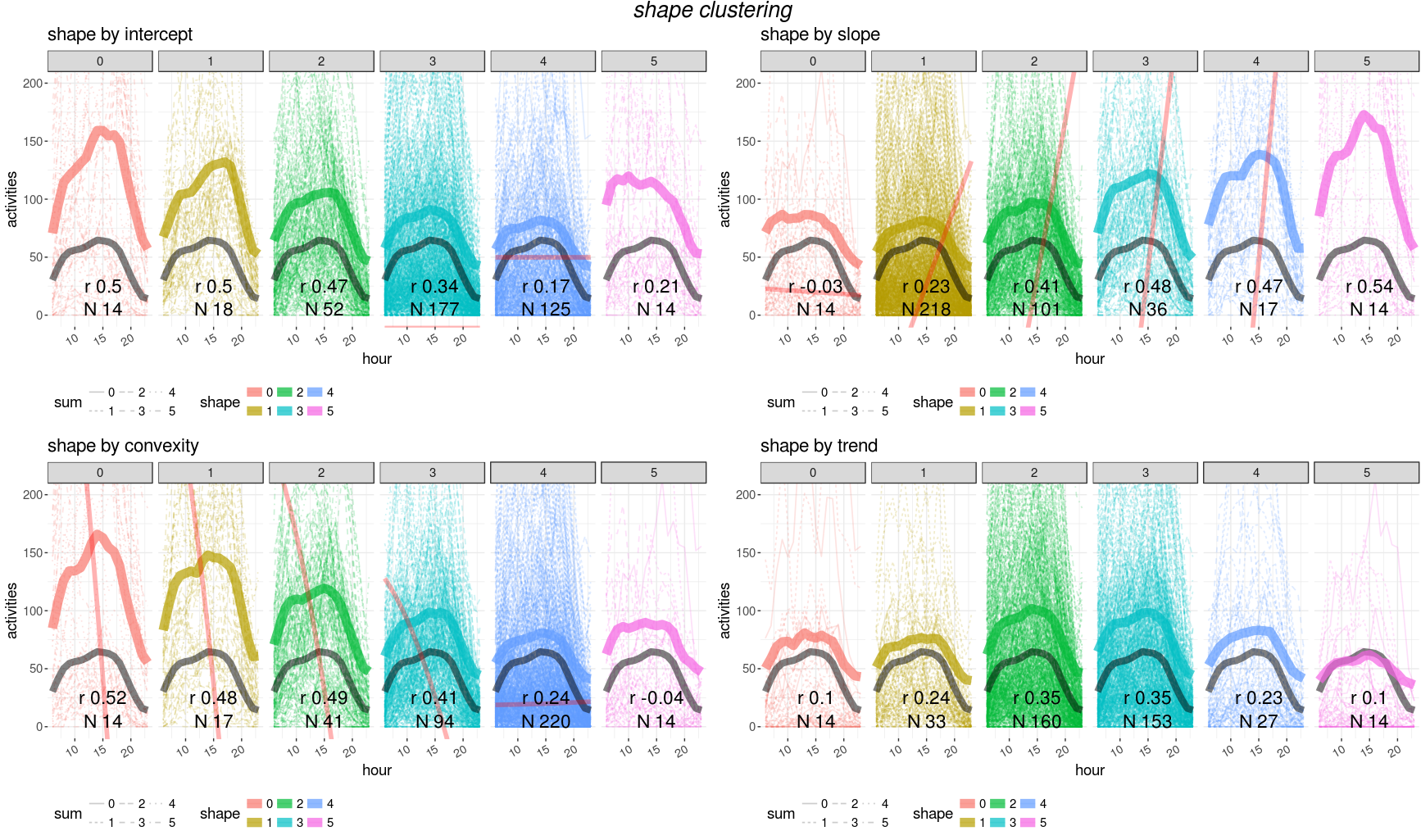 clustering curves (average per cluster is the thicker line) depending on different values of: intercept, slope, convexity and trend
Unfortunately no trivial combination of parametes can provide a single filter for a good matching with customer data. We need then to train a model to find the best parameter set for cells and filter selection.
We need to find a minimal parameter set for good model performances and spot a subset of features to use for the training. We realize that some features are strongly correlated and we remove highly correlated features
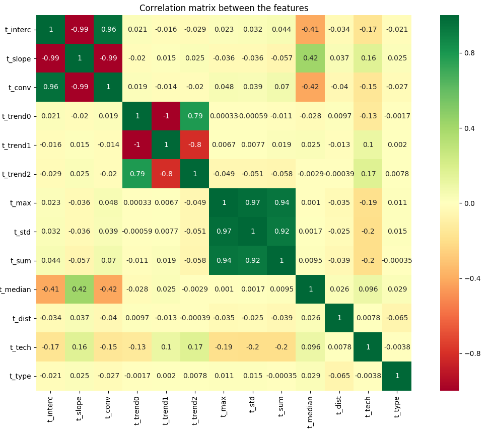 correlation between features
| name | description | variance |
|---|---|---|
| trend1 | linear trend | 5.98 |
| trend2 | quadratic trend | 4.20 |
| sum | overall sum | 1.92 |
| max | maximum value | 1.47 |
| std | standard deviation | 1.32 |
| slope | slope x1 | 1.11 |
| type | location facility | 1.05 |
| conv | convexity x2 | 0.69 |
| tech | technology (2,3,4G) | 0.69 |
| interc | intercept x0 | 0.60 |
| median | daily hour peak | 0.34 |
High variance can signify a good distribution across score or a too volatile variable to learn from.
We select five features which have larger variance to increase training cases.
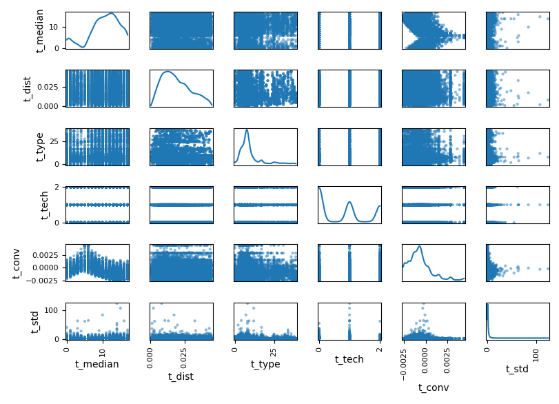 final selection of features
We use the class train_shapeLib.py to calculate the score between users data and customer data. We calculate the first score, cor, as the Pearson’s r correlation:
$$ r = \frac{cov(X,Y)}{\sigma_x \sigma_y} $$
This parameter helps us to select the curves which will sum up closely to the reference curve.
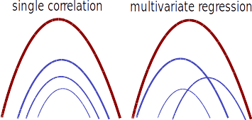 the superposition of many curves with similar correlation or many curves with heigh regression weights leads to a good agreeement with the reference curve The second parameter, the regression reg, is the weight, w, given by a ridge regression
$$ \underset{w}{min\,} {{|| X w - y||_2}^2 + \alpha {||w||_2}^2} $$
where α is the complexity parameter.
The third and last score is the absolute difference, abs, between the total sum of cells and reference data:
$$ \frac{|\Sigma_c - \Sigma_r|}{\Sigma_r} $$
per location
We loop over different model using the class train_lib.py on the script: train_tank.py
First of all we have to bin the scores into classes using the function binOutlier which clamps the outliers into boundary bins. For each score we choose the propriate threshold for the outliers.
n = nBin
ybin = [threshold] + [x*100./float(n-1) for x in range(1,n-1)] + [100.-threshold]
pbin = np.unique(np.nanpercentile(y,ybin))
n = min(n,pbin.shape[0])
delta = (pbin[n-1]-pbin[0])/float(n-1)
pbin = [np.nanmin(y)] + [x*delta + pbin[0] for x in range(n)] + [np.nanmax(y)]
t = np.array(pd.cut(y,bins=np.unique(pbin),labels=range(len(np.unique(pbin))-1),right=True,include_lowest=True))
t[np.isnan(t)] = -1
t = np.asarray(t,dtype=int)
return t, pbin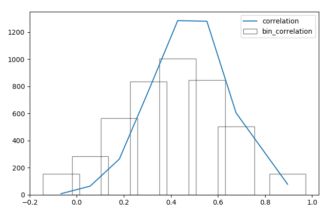 distribution of the correlation score and the corrisponding binning
We compare the different models and select the best perfroming for the purpose.
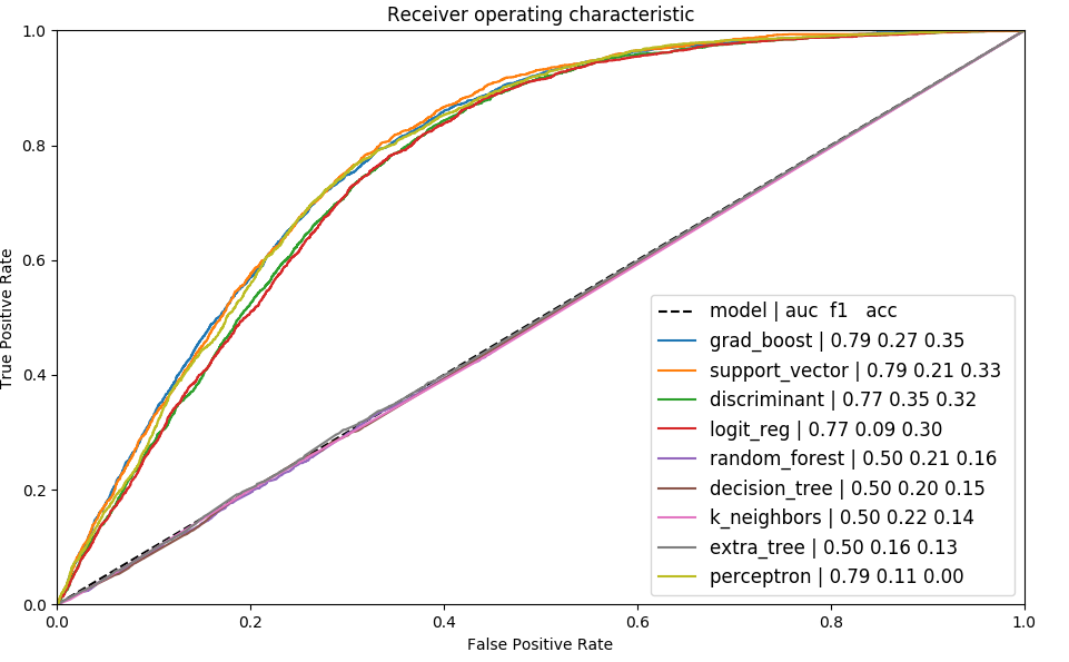
We further tune the best performing model. Alternatively we use keras for high performace model tuning: train_neural.py
We observe different performances between models, we use the model with best train score and area under curve.
We observe that all the scores have a good post prediction agreement (apart from regression)
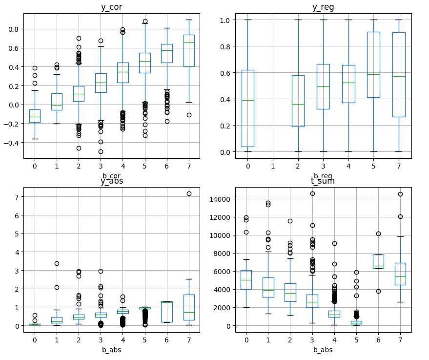 for each variable score we see how the predicted bins (b prefix) classify the input scores (y prefix)
The steps are mainly performed in this script train_tank.py.
The first score we want to optimize is the correlation. We can indeed see how the model filtered the cells leaving the ones with higher correlation.
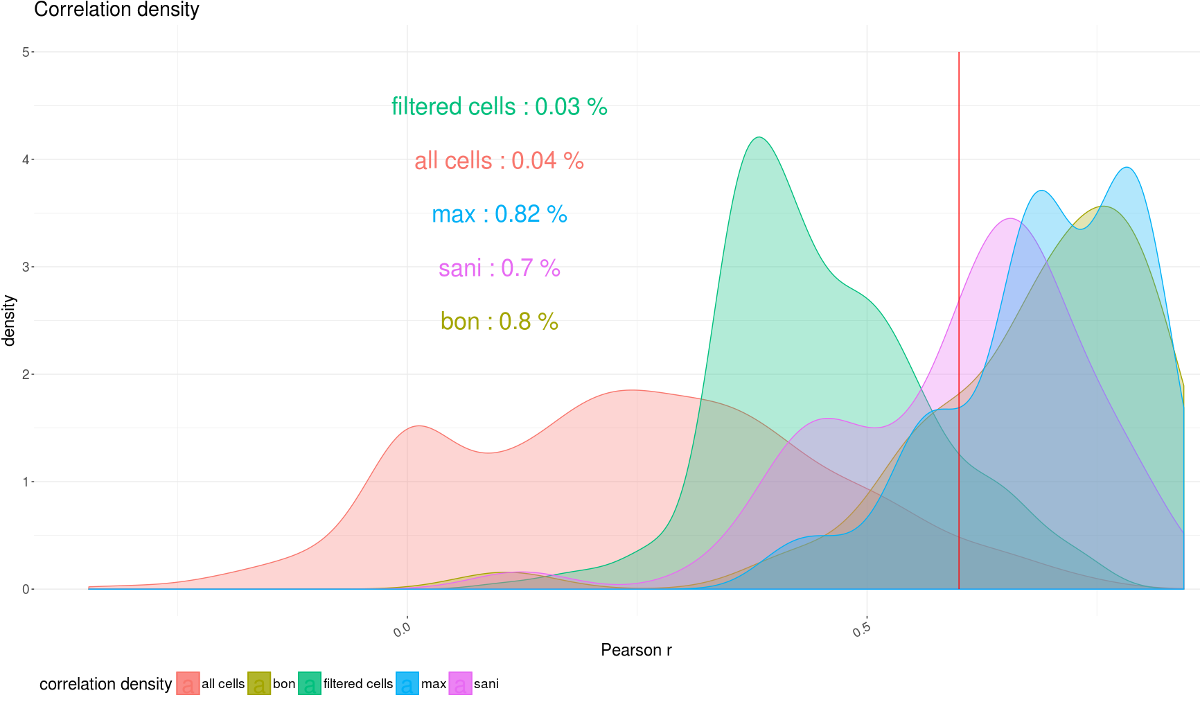 density plot of correlation before and after the filter and dependent on different metrics
We select the cells that have the highest correlation scores and we limit the number of cells by the highest regression.
We then sum up all the cells within the same cluster and recalculate the correlation between locations.
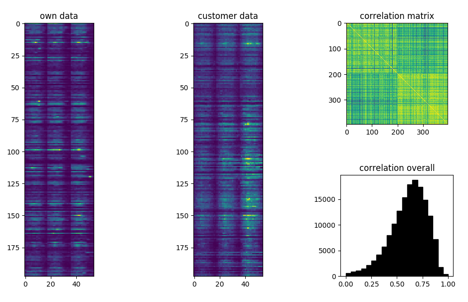 matrix representation of the predicted and reference time series, correlation between the two matrices
Once we have labelled all the cells with a score we can filter the cells whose score is above a certain threshold. We have in total three scores, each score has a continous version (calculated on reference data) a the discrete version (model prediction).
| variable | quantity | type | values |
|---|---|---|---|
y_cor |
correlation | continous | [ − 1, 1] |
b_cor |
correlation | binned | 1, 2, 3, 4, 5, 6 |
y_reg |
regression | continous | [0, 1] |
b_reg |
regression | binned | 1, 2, 3, 4, 5, 6 |
y_dif |
difference | continous | [0, 5] |
b_dif |
difference | binned | 1, 2, 3, 4, 5, 6 |
We investigate the cumulative distribution of the scores plotting on the same graph correlation and difference
We select all cells and we plot the cumulative distribution  cumulative distribution of correlation and difference
We then select the best performing filter although we cannot optimize both correlation and difference at the same time.  we select only the cells whose correlation is above 0.30 (lhs) and those whose binned correlation is above 4 (rhs)
If we apply direction dinstinction locations become 325 instead of 201 but correlation drops  cumulative distribution of correlation and difference
We can still improve the correlation by apply a score selection  we select only the cells whose correlation is over 0.30 (lhs) and those whose binned correlation is above 4 (rhs)
We enrich location information with geographic information which can give us addtional information on the specificity of the particular location.
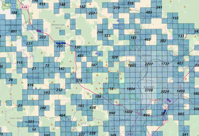 value of the population density on large clusters We added information as the population density or the mean flat area per person for investigating the mismatch within predictions, i.e. in denser area filtering has to be more effective.
For each location we can add as information:
We need to further adjust our results depending on the external parameters, first of all the number of sources available. 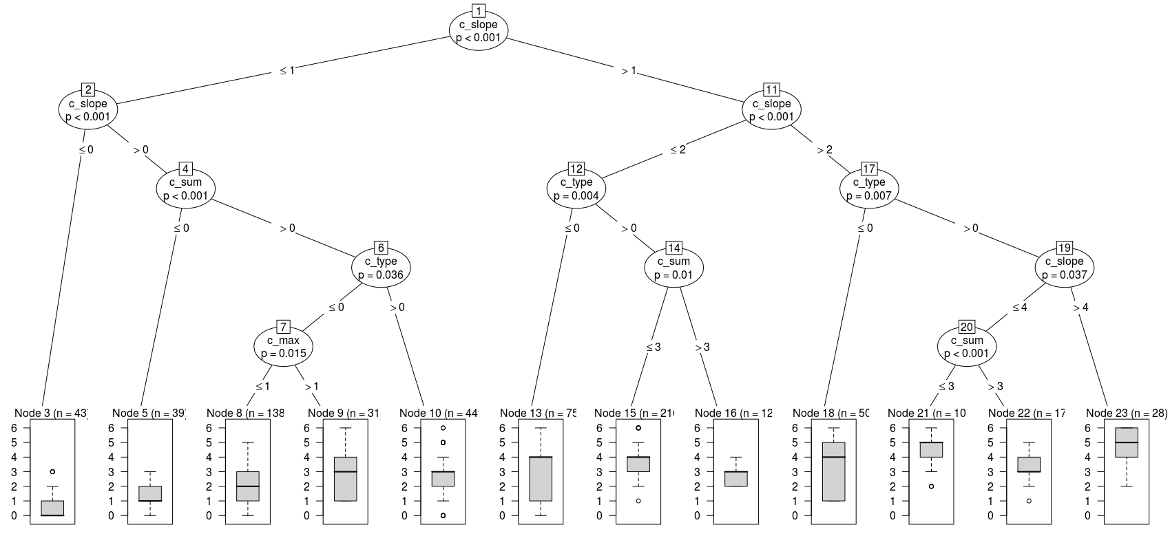 example of a regression tree on prediction results
We analyzed the influence of some features on the counts mismatch train_decisionTree.py and spot the most important features for the predictor.
We analyze the variables dependance on counts mismatch and we calculate a correction factor for all locations
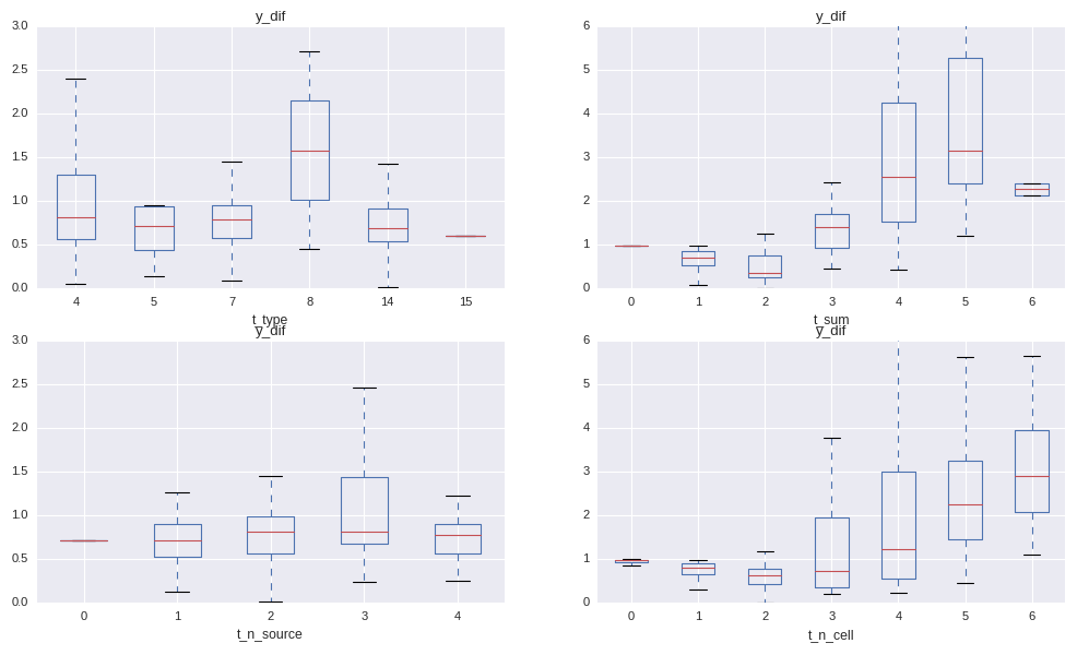 dependance of the mismatch on the variables
We see indeed that the mismatch between activities and reference data is not independant on:
t_type: type of location (binary encoding)t_sum: sum of the cell selectiont_n_source: number of reference sources availablet_n_cell: number of selected cellsWhere the binary encoding is calculated in the following way:
    stypeL = [str(x).split(", ") for x in list(set(typeV))]
    stypeL = np.unique(list(chain(*stypeL)))
    maskV = []
    for i,p in enumerate(typeV):
        binMask = 0
        for j,t in enumerate(stypeL):
            binMask += 2**(j*bool(re.search(t,str(p))))
        maskV.append(binMask)
    return maskV
We choose to use a bagging regressor on decision tree to correct the results based on environmental variables.
We can see how the regressor improves the agreement on absolute counts: 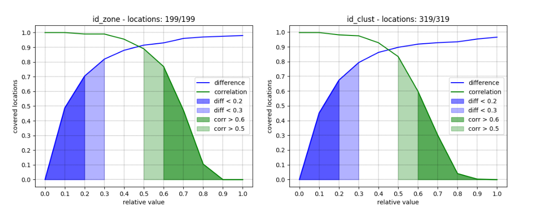 counts mismatch after correction for
 id_zone
A general issue is that we don’t see the same growth as in the reference data:  activity vs reference
Applying both predictor and regressor and we generate: 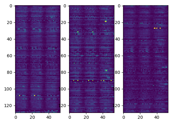 resulting activities per location
We then sort the results depending on a χ2 probability and discard results with an high p_value 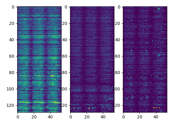 activities sorted by p-value
To summarize we generate the results applying the following scheme: 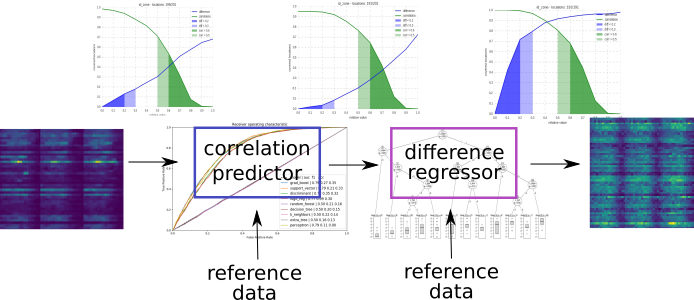 application of the predictor and regressor
The detailed structure of the files and scripts is summarized in this node-red flow charts: 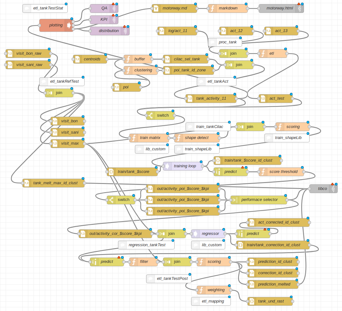 flow chart of the project
We display overall correlation on a map 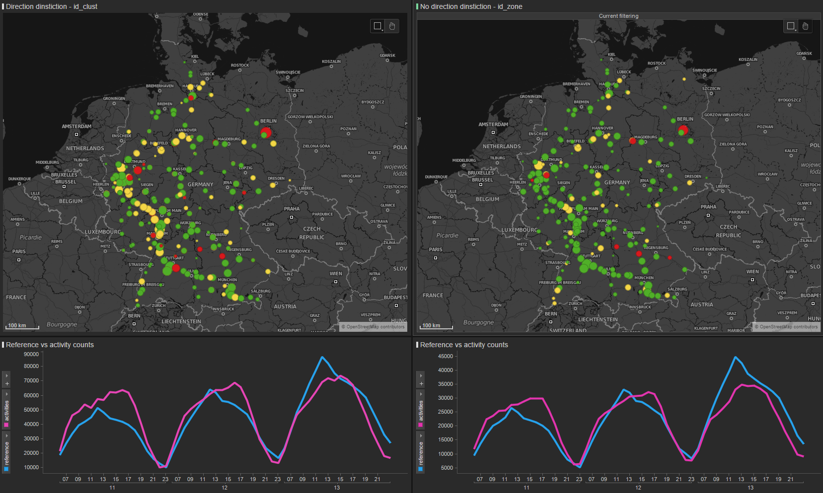 correlation map
Isolated spots show good correlation  example of good correlation
Spots close to cities show bad correlation  example of bad correlation
Correlation increases when take more locations together 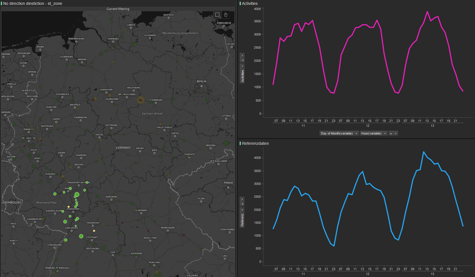 correlation map on a spot
We can calculate the counts even without reference data 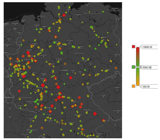 spatial distribution
To calculate the capture rate (number of motorway stoppers over number of drivers on the section in front of the gas station) we route all trips over the motorway network.
In same cases we find good agreement with customer data, seeing the same asymmetry  capture rate. Gray:id, blue:section counts, black:predicted activities, red:measured activities, orange:reference data
We still have to improve the predictions in same cases  capture rate, high predictions
We might even see more symmetry than customer  capture rate, good symmetry
Section counts show numbers comparable to BAst counts leading to around 1.2 person per car.
The project considers:
| description | quantity |
|---|---|
| locations | 937 |
| zones | 191 |
| cluster | 325 |
| cells | 18’190 |
| days | 3 |
Resources:
Operations:
activity_report/run-scripts/start_filter_chains.sh "2017/04/11"trip_extractor/run-scripts/start_trip_extractor.sh -d 2017/04/11activity_report/run-scripts/start_tank_und_rast.sh "2017/04/11"